
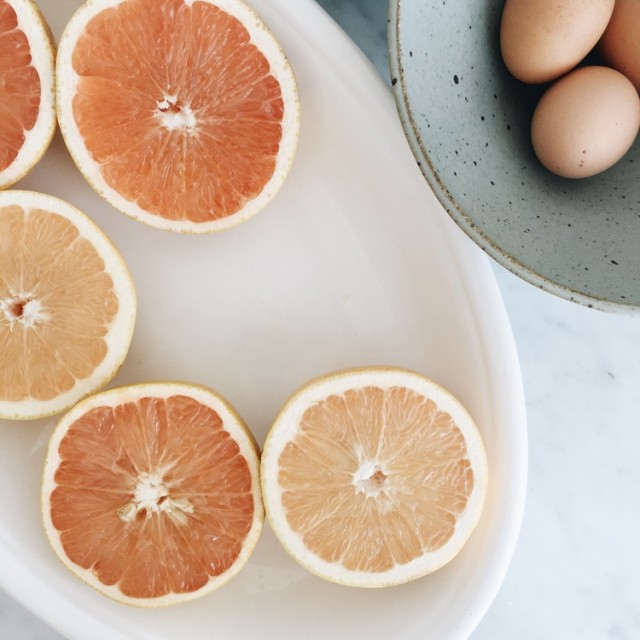
So I guess I’m kinda into pastels now? For a long time I’ve felt like they weren’t really my thing. But I think that’s because when I thought of pastels, I thought of plastic Easter egg colors. Although honestly, even those are starting to have their appeal. The tides may be turning! Or maybe it’s a spring thing. Or probably, I just didn’t realize there’s a whole world of muted hues out there, including some pretty cute options, when combined more carefully.
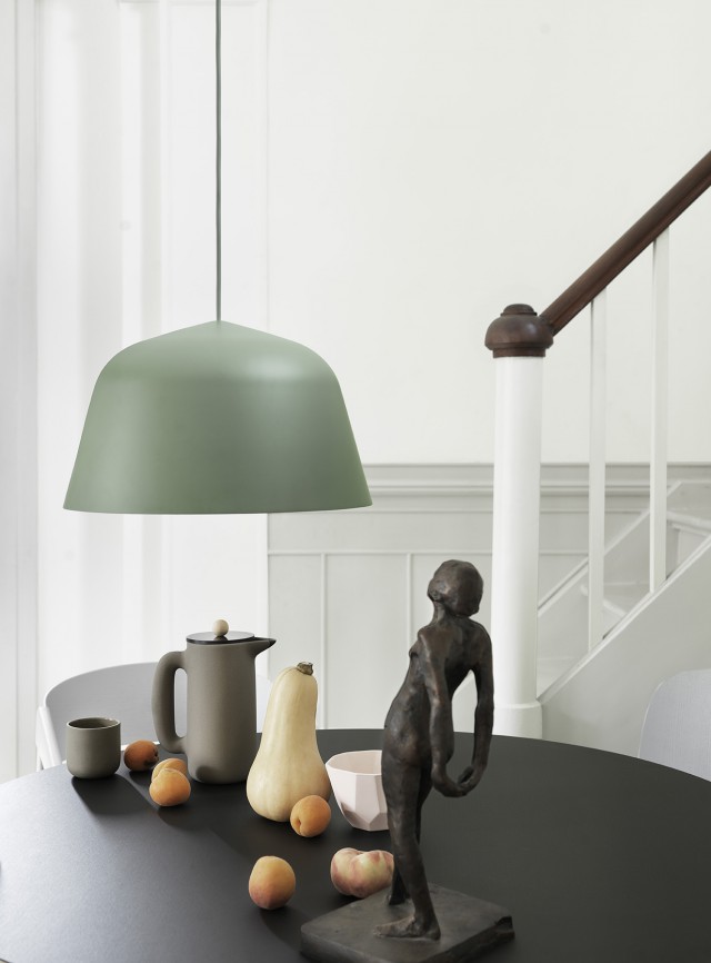
I was looking through my “Colors” Pinboard recently and a clear grapefruit-plus-mint-green color combo emerged. It’s a good-looking duo — and side note — it’s also a tasty one, and Bobby Flay knows it. Anyway, these are also the same shades you find at the beach time time of year. Who could dislike that?
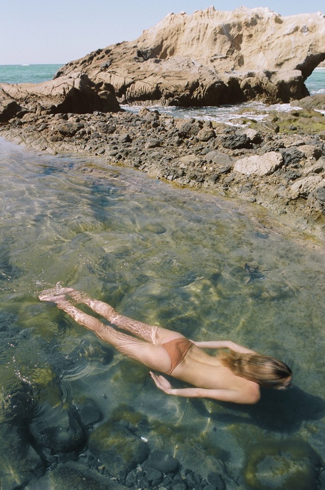
To honor my newfound attraction, I rounded up a bunch of beautiful objects in soft, sandy and ocean-y tones. Happy spring shopping!
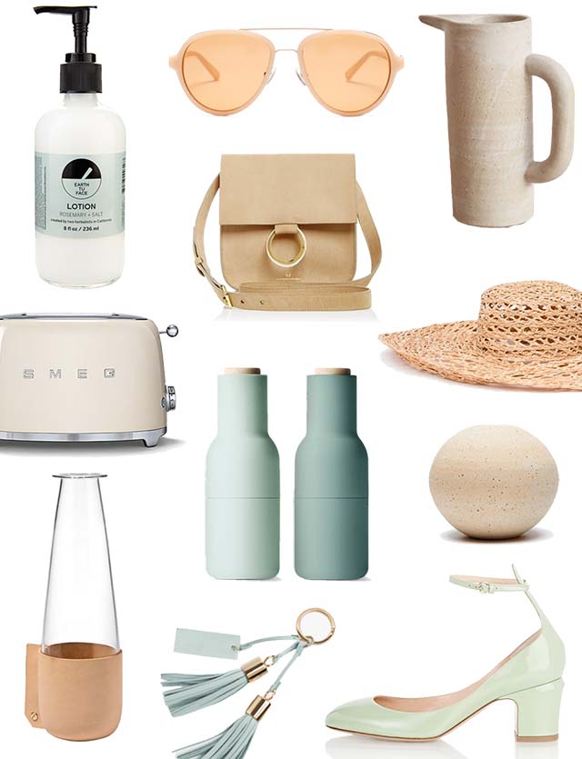
items: lotion / sunglasses / pitcher / toaster / bag / hat / carafe / grinders / vase / tassel keychain / heels
2 Responses to “Grapefruit and Mint”
Deb { 04.03.16 at 7:43 am }
I know pastels go in and out of vogue, but I’ve always liked some soft colour here and there. Your choices are pretty…for me, it is blush and soft blue. I like the way pastels work with my favoured neutrals of black, white, grey and bone too.
Kristen { 04.05.16 at 8:10 am }
So pretty!